


What data display and interpretation means
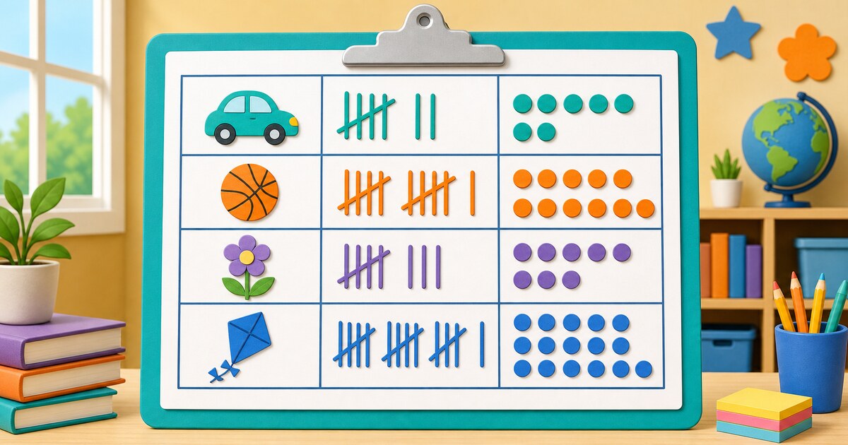
Data is information we collect, such as favorite games, journey times, or plant heights. A display organizes that information so we can notice counts, patterns, similarities, differences, and overlaps.
Six useful Grade 4 displays
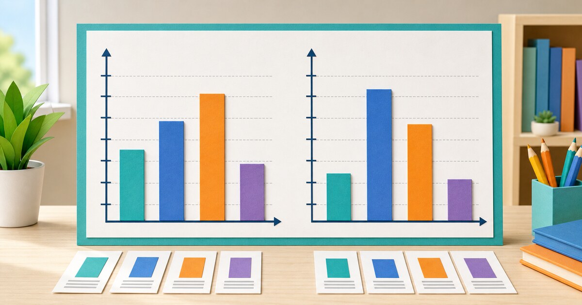
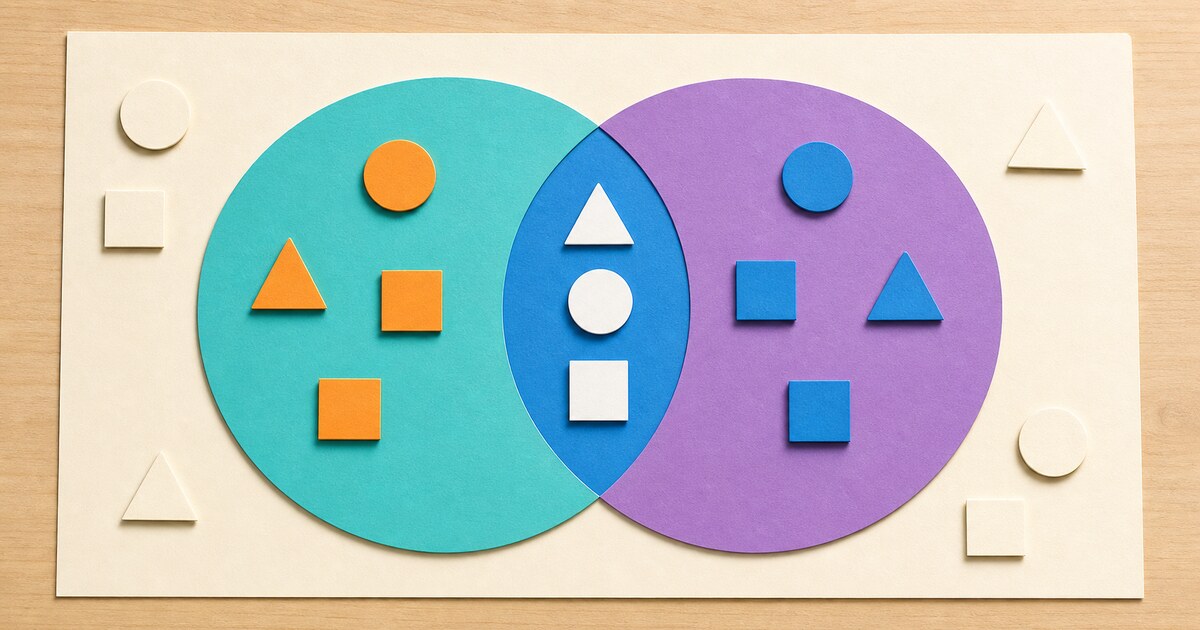
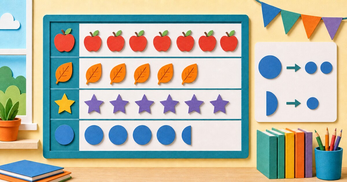
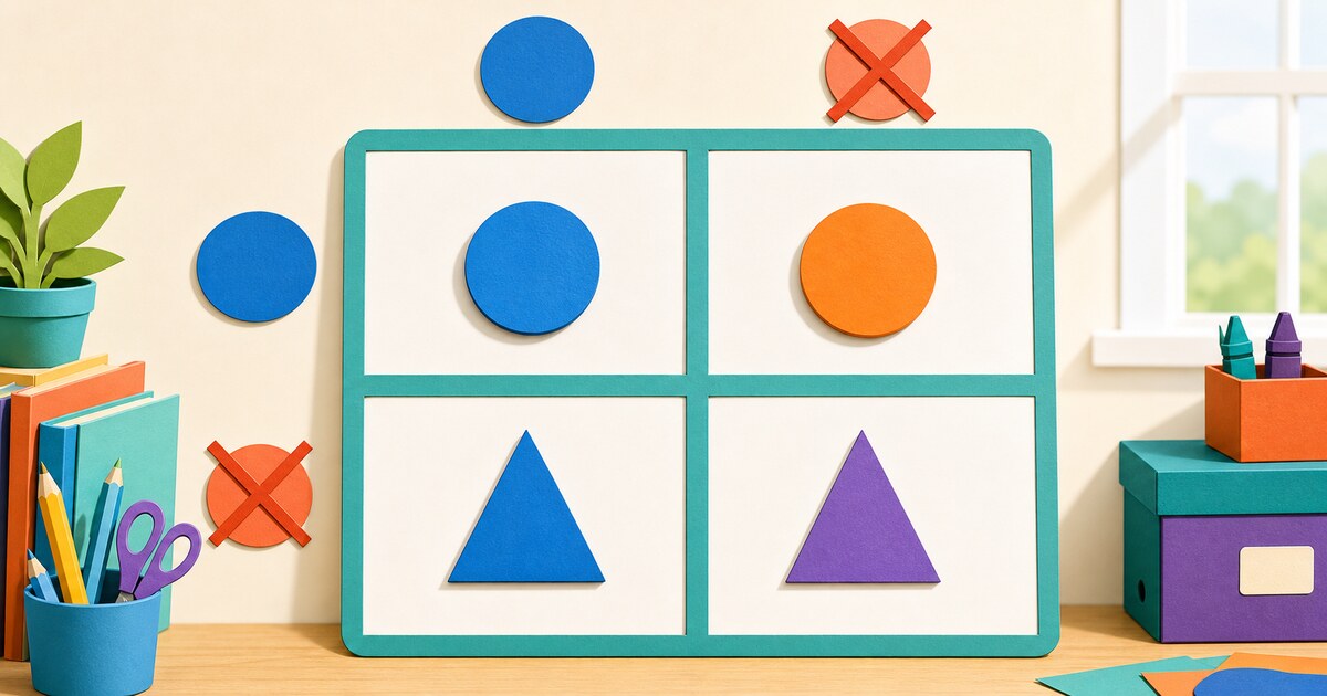
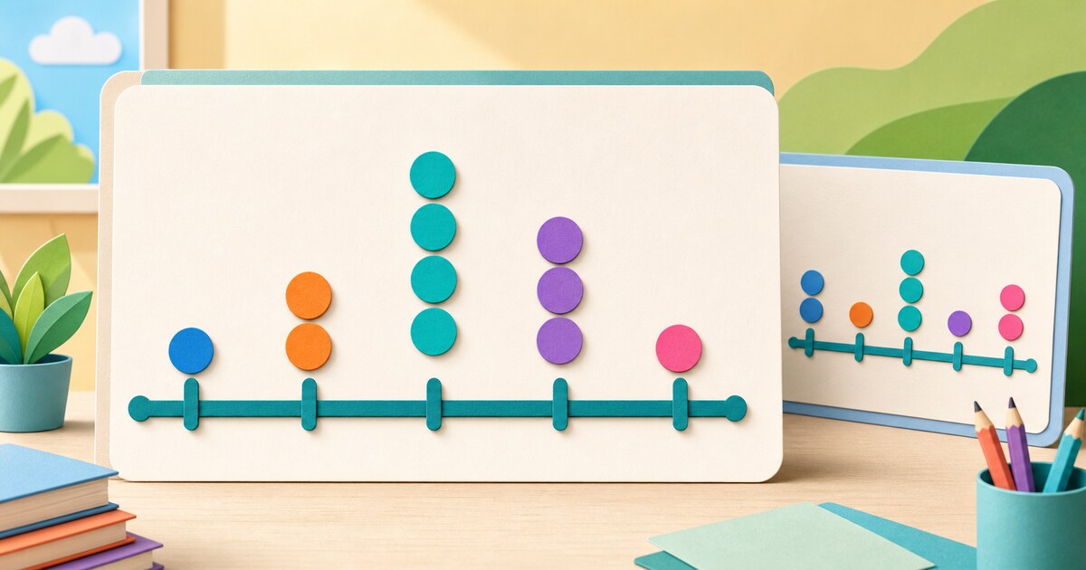
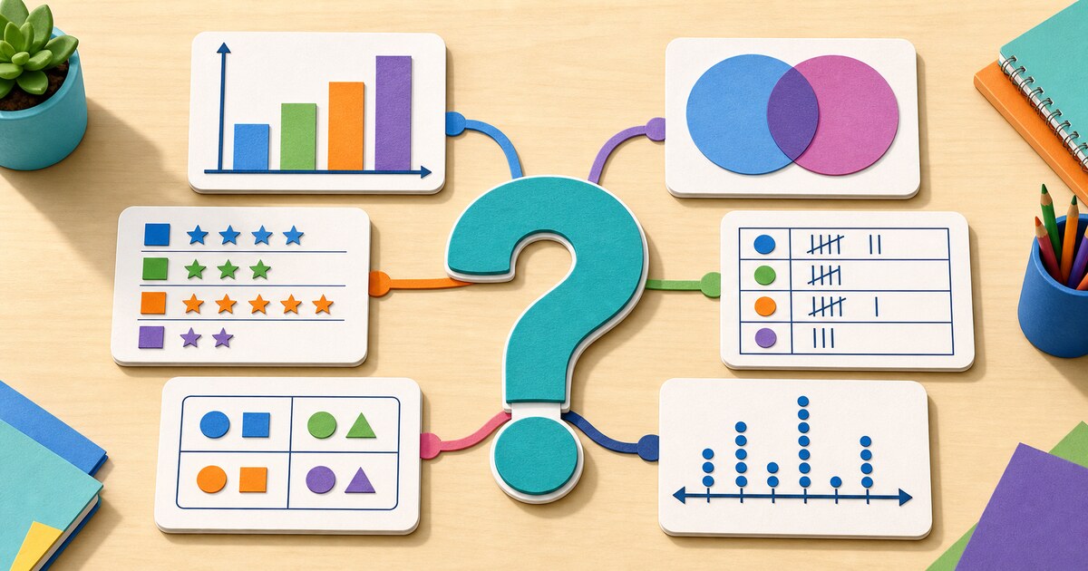
This topic includes bar graphs, Venn diagrams, pictograms or pictographs, frequency tables, Carroll diagrams, and dot plots. Each display has a different job, so the best choice depends on the question you want to answer.
Sorting displays and counting displays
Venn and Carroll diagrams sort items by properties. Bar graphs and pictograms compare category amounts. Frequency tables organize exact counts. Dot plots show how often each number occurs while keeping every individual value visible.
How to study these lessons
Start with the separate lesson for one display. Read its parts, study both solved datasets, and explain the similarities and differences aloud. Finish with the choosing a data display lesson to decide which graph, table, or diagram fits different kinds of information.