

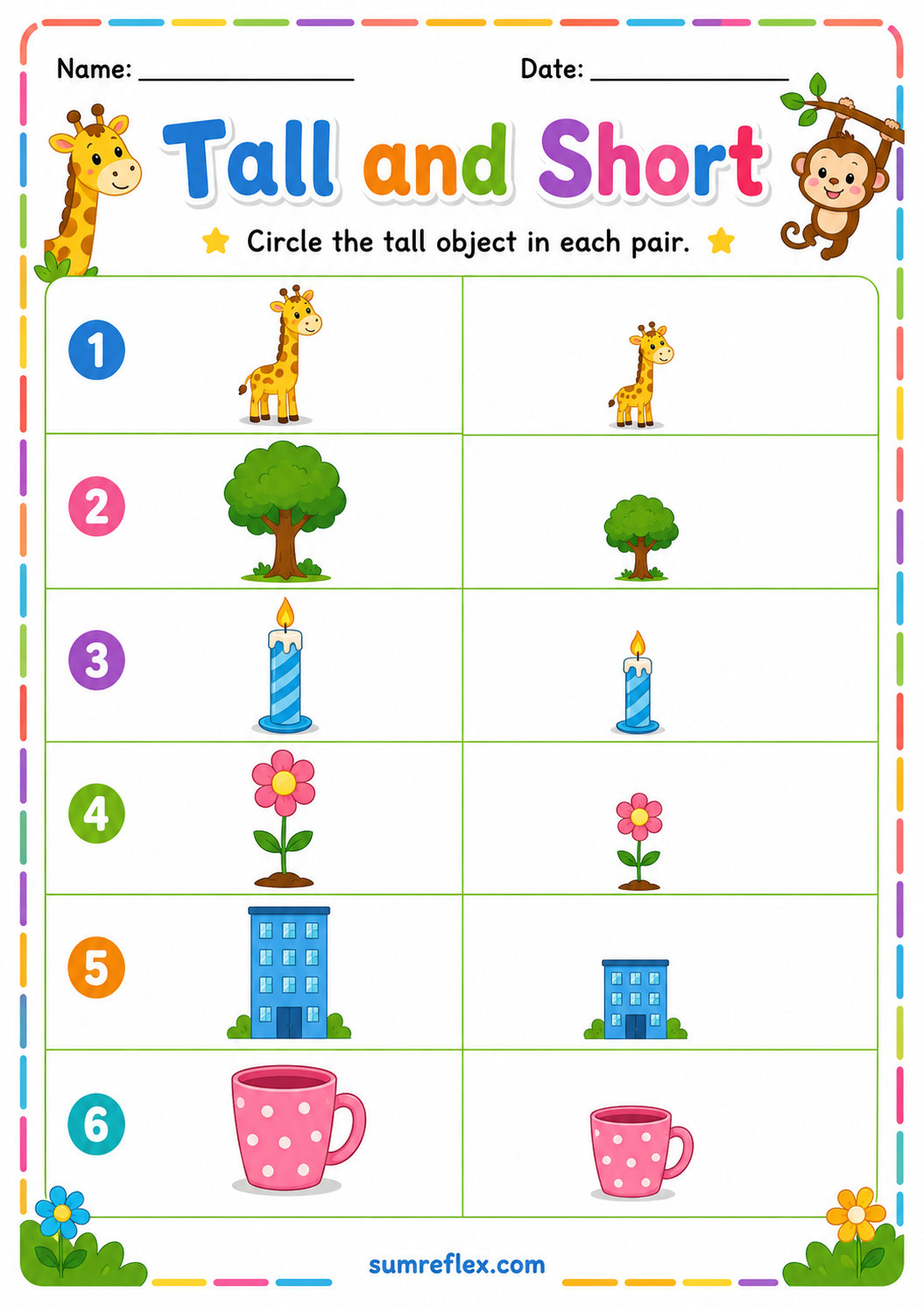
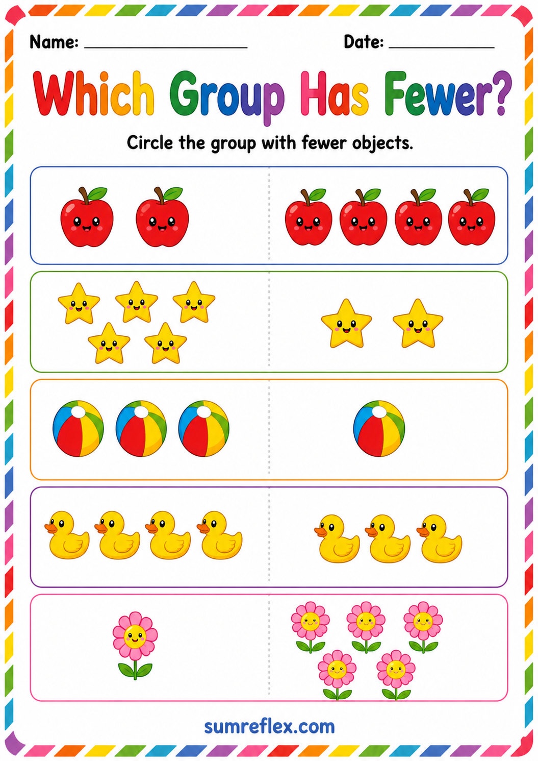
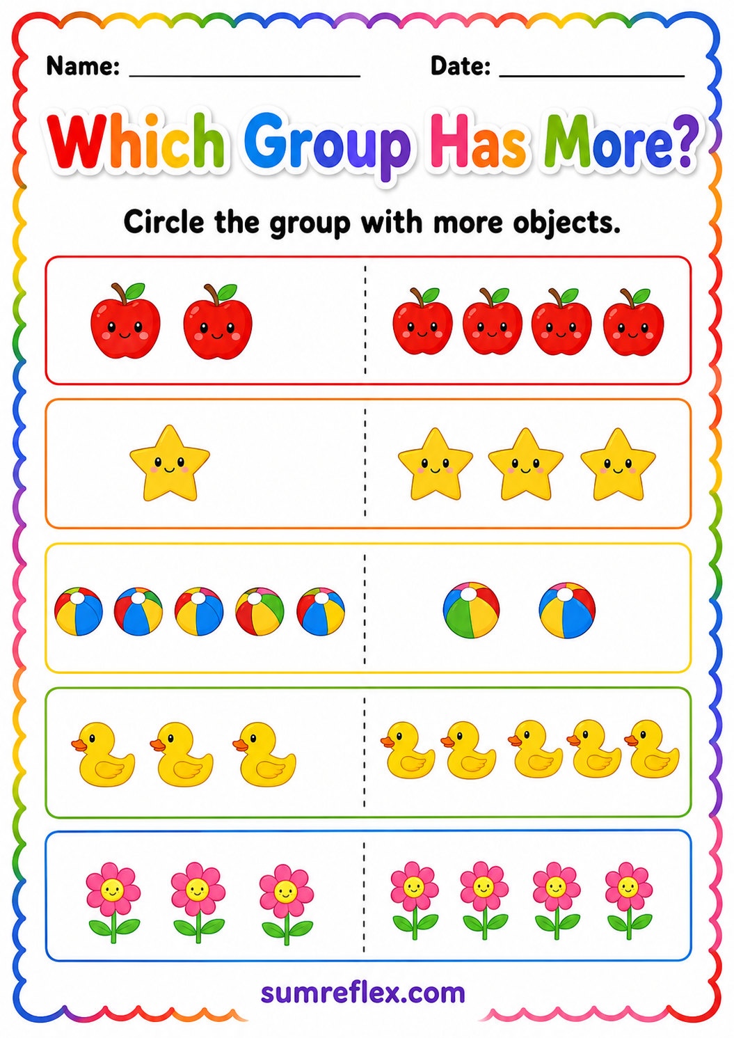
Comparison words need two things to inspect
A word like taller, shorter, more, fewer, full, or empty becomes meaningful when a child can compare it with another picture. These worksheets give the learner visible choices so the word is tied to a decision. The child is not only naming a picture; they are noticing how one picture differs from another.
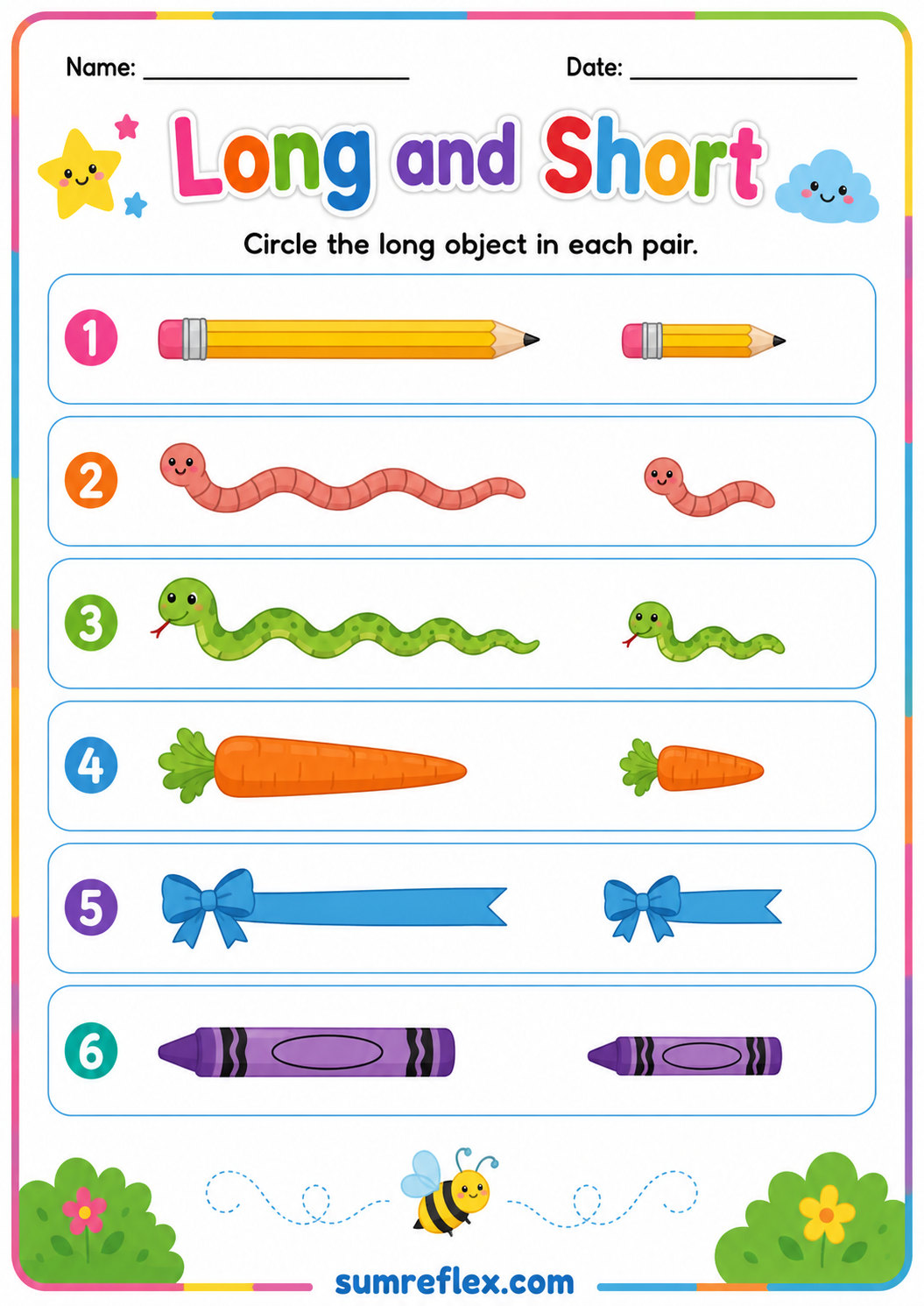
Size words are not all the same
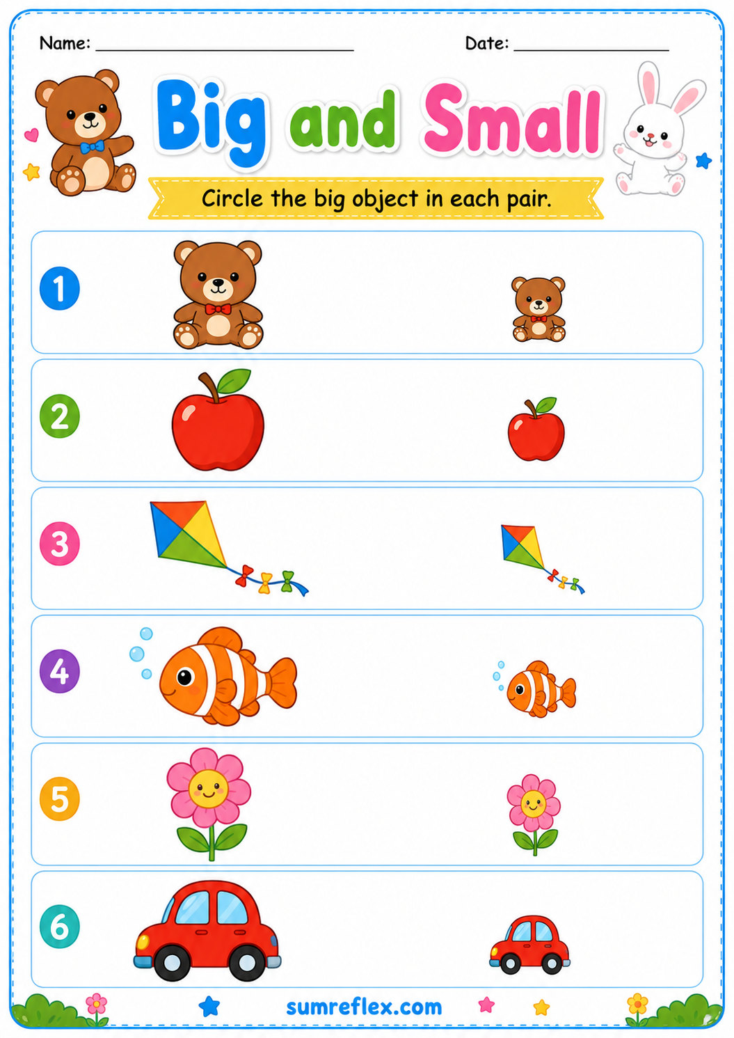
Big and small describe overall size, tall and short describe height, and long and short describe length. Preschool learners often mix these words because they all feel like size language. Use one page type at a time and ask the child to point to the feature being compared. That makes the target word clearer.
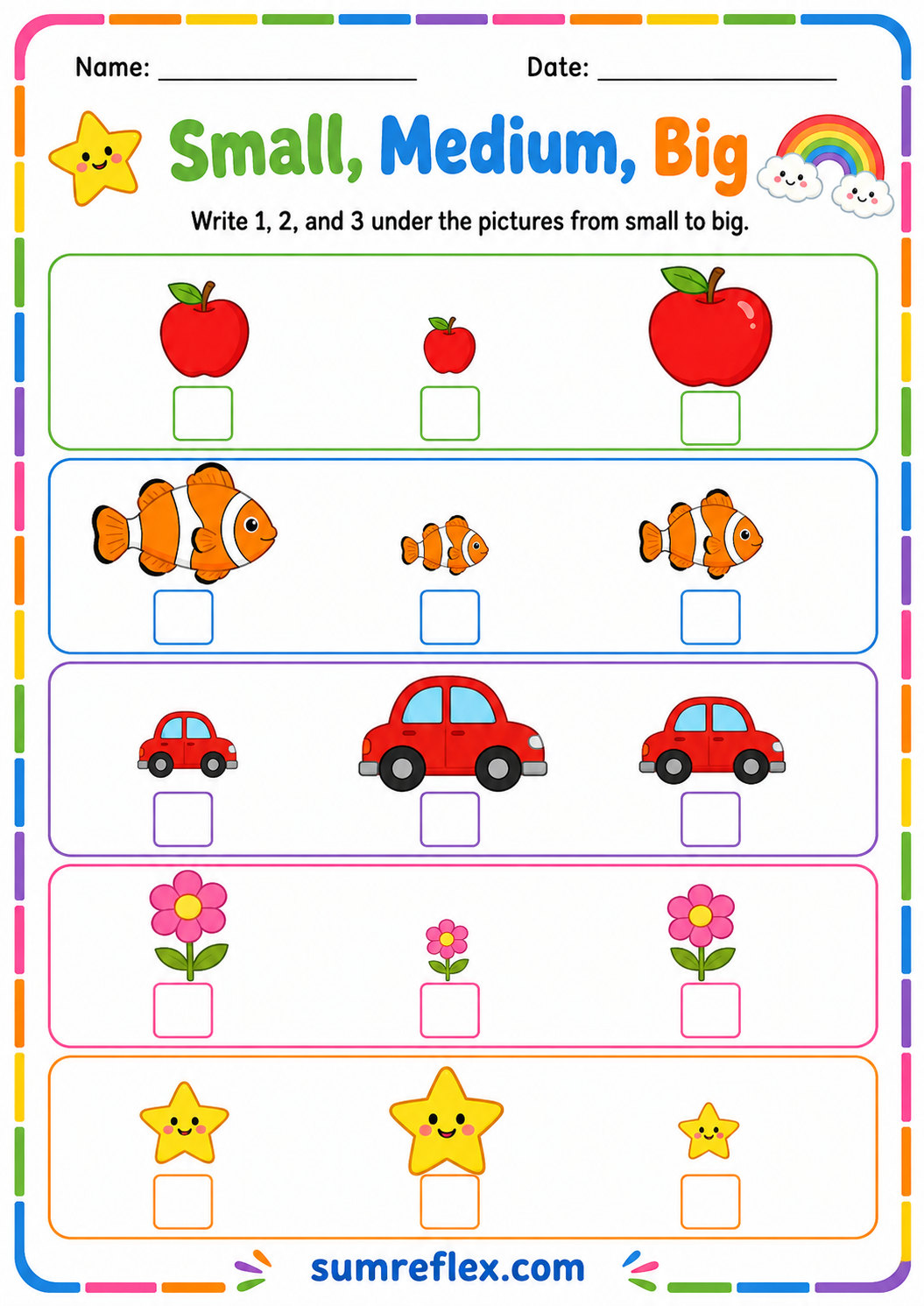
Three-size sets add a middle idea
Small-medium-big work is harder than choosing between two pictures. The child has to understand that one object can be between the smallest and the biggest. Use real objects if needed, such as three blocks or three crayons. Then return to the worksheet and ask which picture is not at either end.
Position words need a reference point
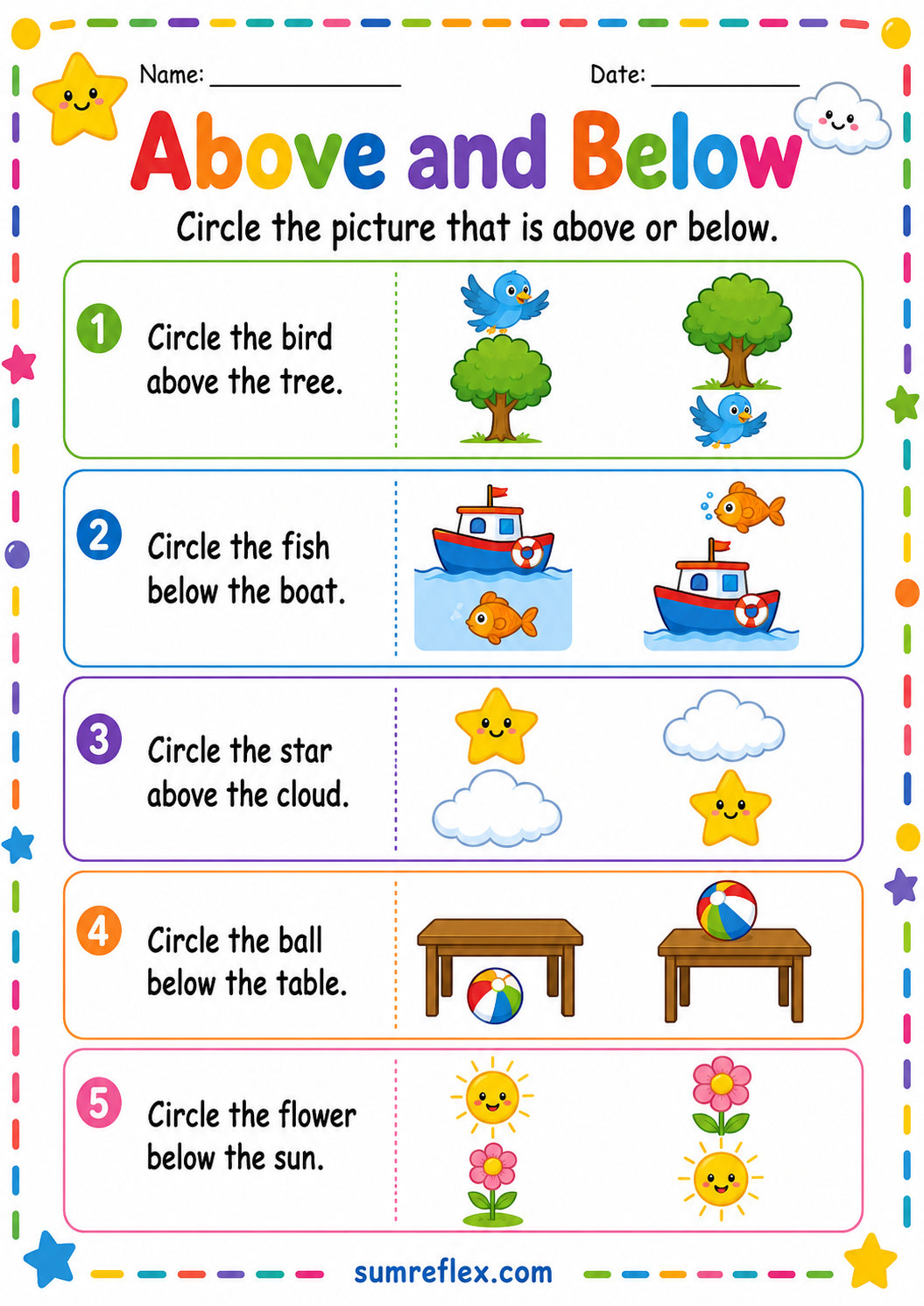
Above and below only make sense when the child knows what object is being used as the reference. Point to the reference first, then ask what is above it or below it. This prevents the learner from looking at the whole picture randomly and guessing based on the most interesting object.
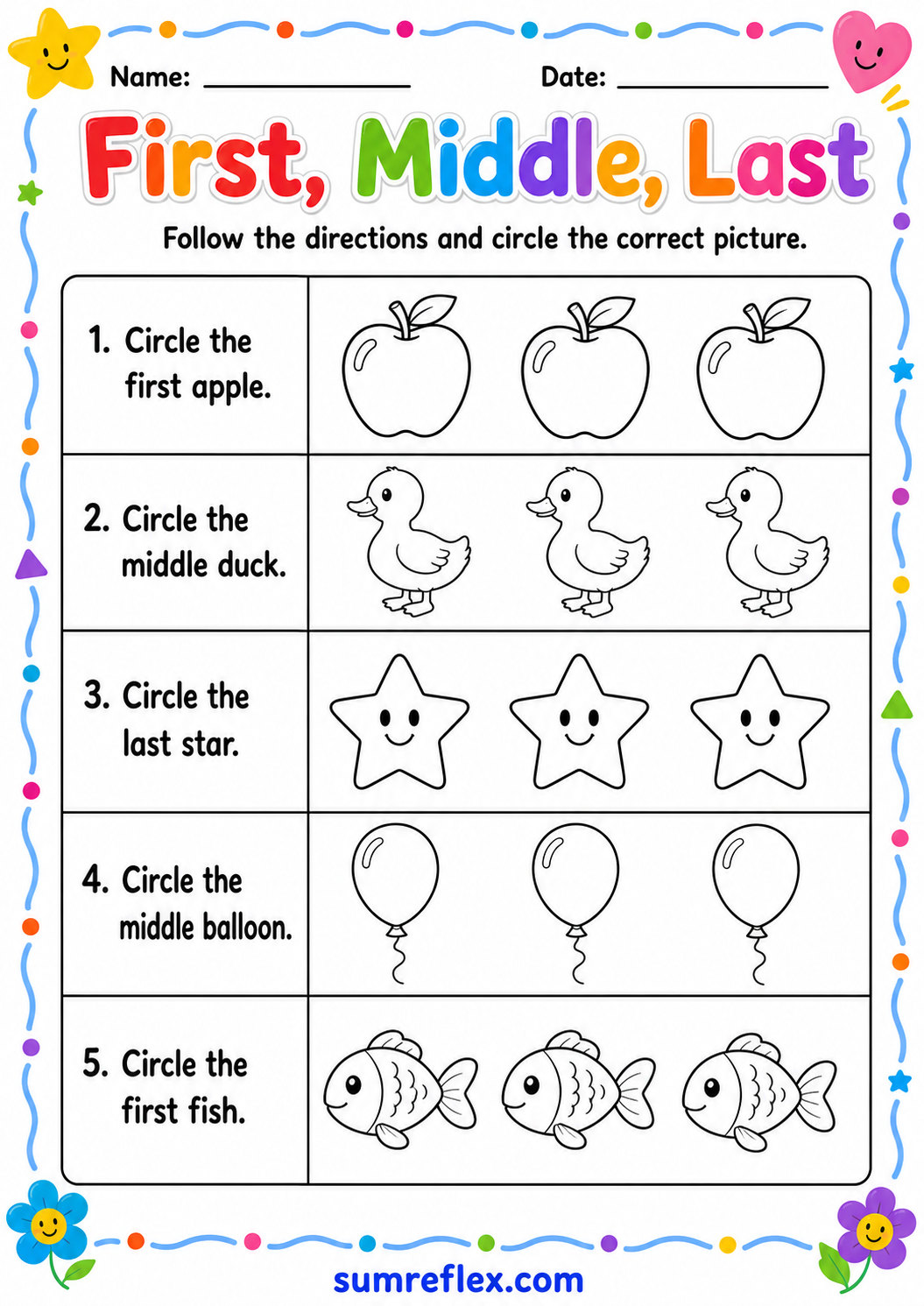
Order language should be read from a direction
First, middle, and last depend on where the row begins. Before answering, decide which way the row is being read. Touch the first item, slide to the middle, and finish at the last item. This physical movement helps the child understand order words instead of memorizing the placement on one worksheet.
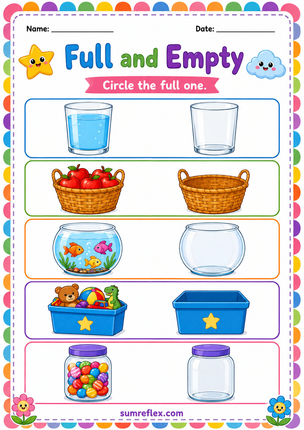
Full and empty can be practiced during routines
Capacity language becomes stronger when it is used outside the page. A cup can be full, a box can be empty, and a basket can be almost full. After the worksheet, use snack time, cleanup, or water play to repeat the words. Real examples keep the printed comparison from feeling isolated.
More and fewer may require counting
Some groups can be compared by sight, but others need counting. Encourage the child to count both groups when the difference is not obvious. More and fewer are quantity words, so the answer should come from the amount shown, not from the group that has bigger pictures or brighter colors. If the two groups are close, place a finger on each item while counting so the comparison stays fair.
Ask for the comparison sentence
After a choice is marked, ask for a short sentence: this pencil is longer, this tower is taller, this group has fewer, or this cup is empty. The sentence helps the child use the comparison word correctly. Speaking the answer also reveals whether the learner understood the direction or only copied a mark. Keep the sentence tied to the exact pictures shown.
Return to difficult words in daily life
Position, capacity, and order words often need many small exposures. If a worksheet is uncertain, do not treat it as failure. Repeat the same word during play, reading, snack time, or cleanup. Preschool comparison language grows through repeated real use as much as through printable practice. A child may understand the word during play before they use it confidently on paper.